
How to Increase Traffic and Sales through Great Website Design?
November 2, 2023 | Ishita Karar
Table of Contents
In today’s fast-paced world, people value instant solutions and trustworthy results.
Did you know that 66% of people prefer online shopping over buying from a physical store?
This is because online shopping provides you with a range of options and saves you a lot of time as well.
According to a study conducted by Stanford, 75% of people determine a brand’s credibility based on its website design. This highlights the importance of having a visually appealing, user-friendly website.
An imperfect web design can lead to a negative user experience. This happens due to improper layout, unfriendly navigation, no proper credibility, slow loading speed, etc. As a result, the users would switch to another website the moment they find any of these faults.
Many business owners may believe that having a website is sufficient for their online business to thrive. Mr. Henry Thomson, a local baker from Dallas was one among them.
From Home Bakers to Online Success: The Role of Web Design in the Thomson’s Journey

Mr. and Mrs. Thomson were passionate about baking donuts. Earlier, they used to bake only for family and friends and received a lot of compliments.
As time went by, people were impressed with the quality of their donuts and asked them to cater small parties and functions. The couples opened their donuts store, which slowly picked up the pace and became popular all over the neighborhood.
Eventually, they implemented the idea to go online and expand their business across the city.
They created a website for their donuts business. They named their online shop. They uploaded pictures of the items they wanted to sell and patiently waited for customers to place orders.
Time went by but unfortunately, the Thomson couple did not get the desired result.
They had a website but were unaware of its design fundamentals, which made their website incompetent.
One of their close friends once advised them to seek help from expert web designing professionals.
Later, the baker couple turned to one of the best Dallas web design companies. There, they got to know about their website’s design issues.
The design of a website impacts the customers. Understanding the criteria of a well-designed website can be challenging for businessmen, like Mr. and Mrs. Thomson.
In this article, we’ll discuss some common website design flaws and how to rectify them to boost sales. Check if you’re making the same mistake?!
8 Tricks to Boost Sales Through Website Design
A website is often the first touch point of contact between your brand and potential customer. It creates a perception of your brand in the visitors’ minds. Overall, the website is one of the most valuable assets of one’s business.
1. High-quality Visuals
One of the most important things that a user notices is the website’s visuals. Therefore, it is essential to grab their attention through it.
Implementing visuals, like images and videos, on a website helps grab users’ attention towards it. The visuals add extra information and make the content or product stronger and clearer. It helps in conversion by playing an important role in branding and creating brand recognition.
The Thomsons didn’t understand the importance of good visuals. Their websites had a few images, but they were not good quality.
If you wish to drive customer engagement and boost sales through your website, consider implementing high-quality visuals.
Below are a few examples of visuals that can add personality to your website design:
- Use high-resolution product images.
- Add creative illustrations to your website which will enhance the website message.
- People find it easier to understand clear icons.
- Use good quality product videos wherever possible.
- Use charts if needed.
You can use these visual elements between or along paragraphs and page edges. This will reinforce the message of your text or content.
Like the Thomson couple, if you sell food too, consider uploading clear photos of your product and baking videos to increase reliability.
2. Easy Navigation
Website Navigation plays a key role in guiding a customer to his or her destination and making a purchase.
Therefore having user-friendly navigation is crucial for every website.
In general, website navigation is categorized into four navigation areas:
- Primary Navigation: It is the main menu bar, located at the top of a web page. Usually, the logo is placed at the top left side and the primary navigation bar starts from the middle or top-right of a website.
- Top Bar Navigation: This is also called the breadcrumbs of a website. The top bar navigation is placed in a smaller line above the primary navigation bar. It includes callout links or sign-in/up links. Usually, this bar appears on every page so that users can easily sign in or sign up.
- Sidebar Navigation: Sidebar navigation is used when a website has too many pages and those pages can be grouped into a single category. This navigation is often found on ecommerce websites that sell a large number of products. Sidebar navigation is usually present on the left side, but it can also be on the right side. Adding this navigation to a website saves time scrolling to the top and allows users to easily find the categories they need.
- Footer Navigation: You can find some websites having an in-depth footer menu and some websites with a simple footer bar with pertinent links. It depends on the goal and purpose of the website. Experienced professionals from any website design company in Dallas advise including links in the footer menu, especially when it is an ecommerce website.
When a user is unable to find his desired page link in the top bar, he or she can scroll down and get the link from the footer section.
The design of Mr. and Mrs. Thomson’s Donut store’s website failed to provide the users with proper navigation.
Here are some of the best practices by Dallas web design companies. The experts recommend and follow website navigation rules to make sure one doesn’t lose customers:
- Simplicity: Use a simple menu structure that is easier to understand and navigate. Avoid overcrowding your main menu and try to keep it within seven links.
- Consistency: Be consistent with your website navigation and try to keep it the same throughout the website. Make sure it is aligned with the current information of your business.
- Separation: Focus on creating some visual separations to avoid mixing the navigation with your website content.
- Links arrangement by priorities: The main aim of a perfect website design is to make it easy for visitors to find the most important information quickly.
- Users mostly pay more attention to the first few links and the last few links. So arrange your website menu based on the most preferred page, usually the product or service page, by visitors.
- Mobile Friendly: Always make sure that navigation components are well optimized for mobile devices so that visitors will have no problem exploring the website while visiting from a mobile device.
3. Availability of Enough White Space
An overcrowded page that is overwhelmed with text, images, and visuals, fails to grab users’ attention. Mostly, in such cases, visitors fail to understand or focus on the main content of such websites.
The same happened with Mr. and Mrs Thomson’s website. The website’s main page had too much information, like text and pictures, which was not easy on the eyes.
The lack of white space and overwhelming small fonts were affecting the readability of their home page.
White space, also known as negative space, refers to the empty area surrounding content and elements on a web page. Dallas web design experts use this concept to help minimize the amount of clutter on any website.
This makes the website simple and well-organized, improving readability, visual appeal, and the overall user experience.
4. Recommendations & Referrals

As we mentioned before, Mr. and Mrs. Thomson used to bake delicious donuts. People who tasted it, know the fact.
However, what about the people who were not familiar with them? How would the new customers know whether their donuts are tasty or not?
A testimonial section is very important for any website selling products or services. Ratings and reviews given by previous customers build trust and encourage visitors to buy the products.
You can create a separate web-page for testimonials or include the ratings and reviews on each of your product pages.
The experts of a website design company in Dallas always ensure to add a review and testimonial section while designing a website.
5. Short Sale Cycle
A short sale cycle is another important factor for boosting sales. It’s a tactical process that salespersons follow to convert a lead into a customer.
Consumers go through stages like choosing the right product, confirming identity, selecting payment methods, and more, to finish the payment. All these come under a sale cycle.
Sure, many people visited Mr. and Mrs. Thomson’s site but only a few of them completed the checkout process.
As per a study, the average cart abandonment rate across all industries is 70.19%.
A large number of people visit multiple sites and leave their shopping carts abandoned due to a long payment process. Sometimes, there appear multiple pages and forms to fill out during the checkout process which annoys the consumers.
Some websites do not allow their customers to checkout without creating an account. To some buyers, it’s irritating to fill in all their information, like birth-date, email, etc., for a single purchase. They usually leave the process midway.
Dallas web design experts recommend simplifying the process of finding and buying products on websites to improve the customer experience. They focus more on simplifying and reducing the checkout process.
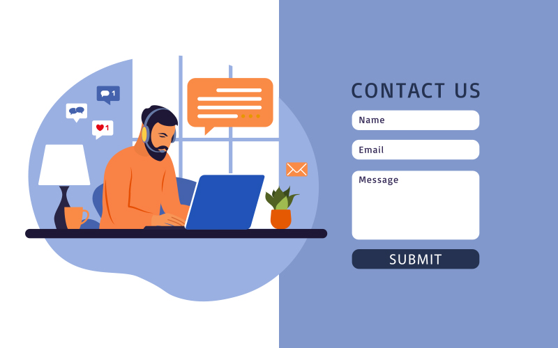
6. Call to Action and Contact Forms
Implementing Call-to-Actions (CTAs) is one of the most crucial aspects of a web page. It helps drive users to the next step which will ultimately lead to conversion.
CTAs can appear in various parts of a website. Such as,
- Pop-Ups
- Banner
- Sidebar
- Header
- End of a Landing page
Below are some general rules to have standout CTAs
- Keep the CTAs short and simple.
- Ensure proper placement.
- Use proper color to grab attention.
Contact forms are another effective way to encourage user interaction. Consider keeping it short by adding only the important fields and keeping it simple by using simple words, hints, and instructions, if needed.
7. Reliability Building Elements

Building trust among customers is crucial for any business.
There are various reliable elements that one can include in their website to increase credibility. For example,
- SSL-secured logo, which indicates your website is safe for transactions.
- Payment provider’s logo, like payment secured by Paypal, Stripe, etc.
- Product certifications, like Greenguard Gold certification or LGA certification for mattresses, and FSSC or IFS certification for food products.
- Icon of Awards given to the website by some reputed organizations.
- Extra benefits like a 100% money-back warranty, free home delivery, etc.
Thomson’s website didn’t have trust-building elements like food safety certificates. These certificates could have made customers feel more confident about the food ingredients and quality.
8. Site Loading Optimization
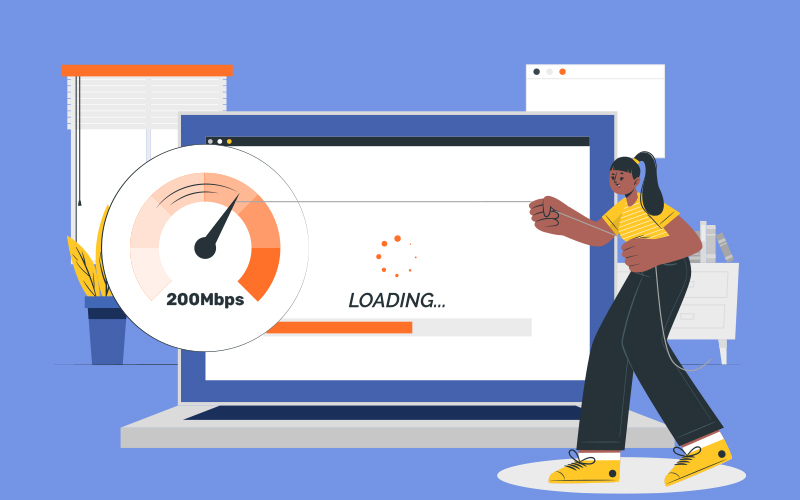
Nothing irritates a user more than a slow-loading website. This was one of the major problems with their Donut website.
As per the study, 53% of visitors abandon a website if it takes longer than 3 seconds to load. There’s no exception for desktop versions.
A website should load quickly from both desktop and mobile.
So, what prevents a website from loading?
A website’s speed can be affected by various technical and design-related issues. Below are some of the website design-related factors that can negatively impact a website’s speed.
- Uncompressed graphics: Complex design with high-resolution graphics can affect your website’s loading speed. To address this, web designers should carefully analyze the graphics and compress them without compromising the graphics quality.
- Overwhelmed animations: Too many animations or illustrations can slow down a website’s loading speed. So, avoid including unnecessary graphics that might not be important for your website.
- Large font numbers: The use of a large number of fonts can delay a web page’s loading time. Use a few readable fonts that won’t slow down the page.
Web designers in Dallas keep these things in mind while designing a website.
Increasing Sales with a Well-designed Website
Through the story of Mr. and Mrs. Thomson, you can understand how little to serious flaws in a website design can impact your ecommerce business.
After consulting with the experienced designers at Dallas Web Design Company, the Thomson couple realized that having a website was not enough to increase sales. The website should be designed with precision to provide a smooth user experience.
Like the Thomsons, if you’re thinking of investing in an ecommerce website, make sure your website is designed well.
After all, your website will function as the identity of your brand.


RELATED POST

Table of Contents 10 Reasons Why You May Need Digital Marketing?Importance of Digital Marketing in Expanding a Business OnlineThe Final...
READ MORE
The online presence of any business, regardless of industry, is paramount in today’s digital-centric world. A well-designed website serves as...
READ MORE
Web hosting companies perform the essential function of connecting a website to the Internet. Therefore, it is important for entrepreneurs...
READ MOREPartners


Copyright © 1999-2026, B3net inc.